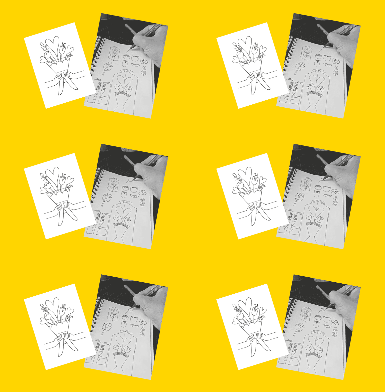
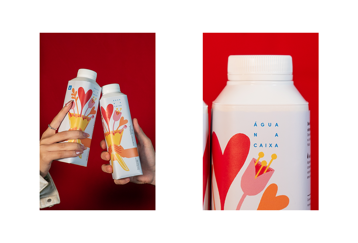
Água na Caixa is a Brazilian company that produces and sells water with a focus on harmony with nature and well-being, and also with a good concern for design. In line with this, they launch illustrated limited editions, and I was invited to illustrate the Valentine's Day edition.

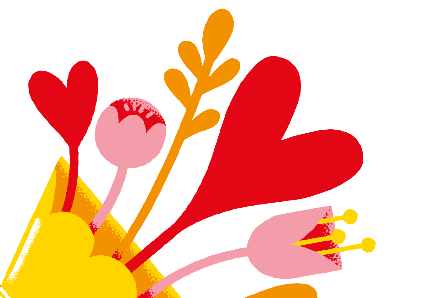
Thinking about the printing method (flexography) the color palette was designed using few colors, to avoid many mismatches and achieve more vivid colors. All colors in the illustration are formed only with magenta and yellow.